
In our last update we were still ironing out the editing experience and ensuring that the sketch previews didn't crash the entire app et cetera.
As of today I think we have achieved a stable enough shell to now populate with learning material.
In this update we'll go over some of the notable changes in the user experience and the technical details behind some of the more interesting ones.
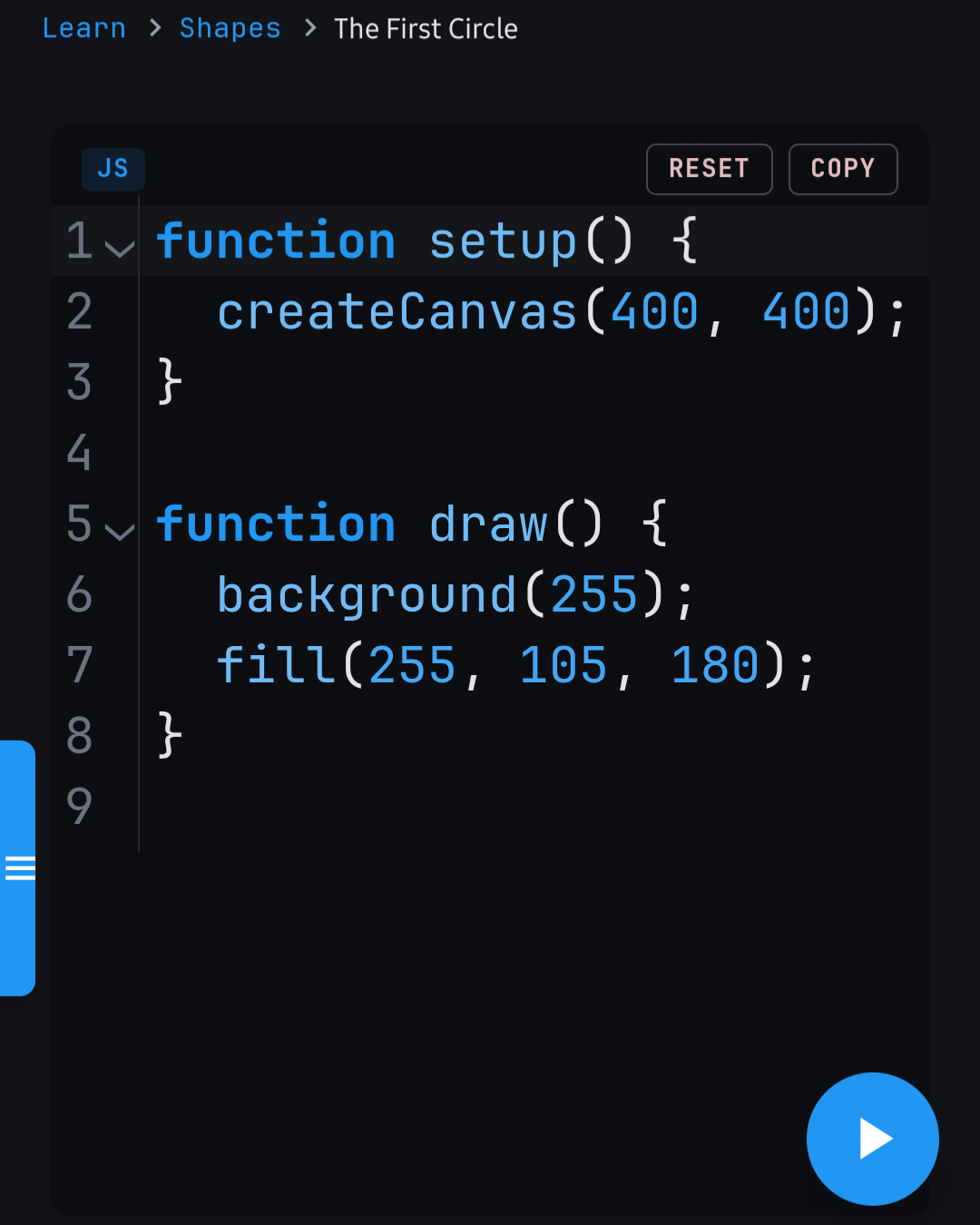
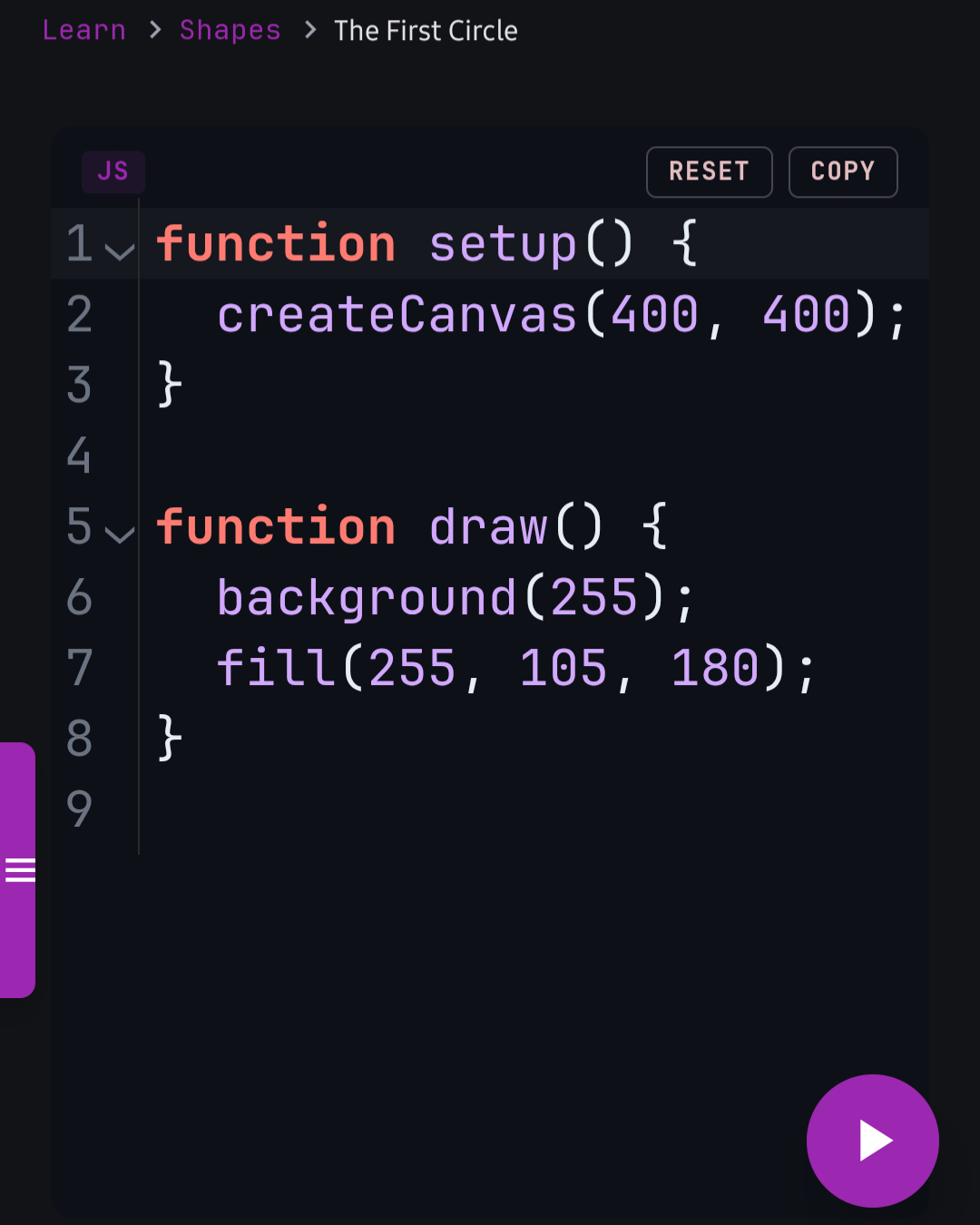
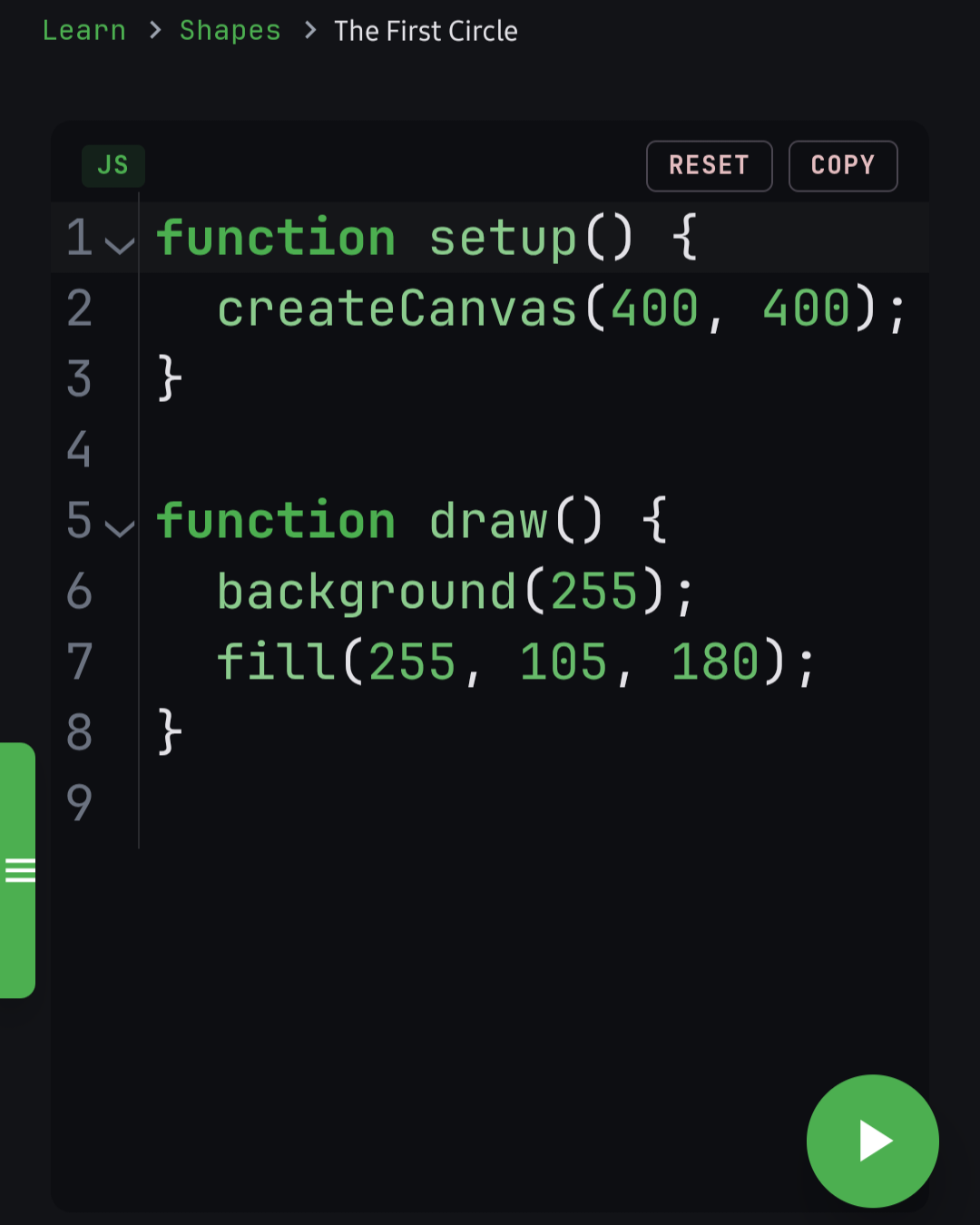
Accent based theming
It's easier to work with one color than many, which was the motivation behind the monochromatic theming approach, where we take one color and apply different shades of it to different parts of the UI.
It affects everything. The icon colors, the helper/small text color, stateful backgrounds and more.
Better code editing experience
Coding on mobile comes with its own set of restrictions which we have to workaround to provide an accessible experience.
Using CodeMirror 6, the app provides an offline code editing experience for p5.js, with two preview canvas views, one for the expected solution and the other for the user's sketch preview. p5.js v2.3.0 is vendored directly into the app so everything works fully offline.
Below are some of the more notable (user facing) features.
Code block themes
With the new accent based theming approach, the default "p5 Learn" syntax highlighting theme dynamically remaps its colors to match the user's chosen accent color. This gives a more unified feel with the rest of the UI, but the user is still free to switch to one of the other three themes (Tokyo Night, GitHub, or a color-vision-deficiency friendly variant of GitHub).
Formatting and text wrapping
Manually formatting code is an unnecessary hassle with the abundant code formatting solutions available so far.
With that, the app uses Prettier (bundled for offline use) to format the user's code both when they press the 'Run' button. This keeps the code readable with no intervention from the user side. If Prettier can't parse the code (e.g. a syntax error), the formatting silently fails and the code stays as-is.
To force the width of the code block, there's a 'Word wrap' toggle option available in the editor settings.
Reset & copy
Perhaps we messed up our code so bad and trying to restore to the original code is the only way to make things simple. Next to the copy button, the user can press the 'Reset' button and the task starter code is restored.
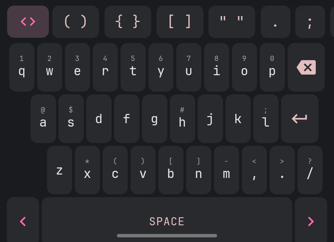
In-app keyboard
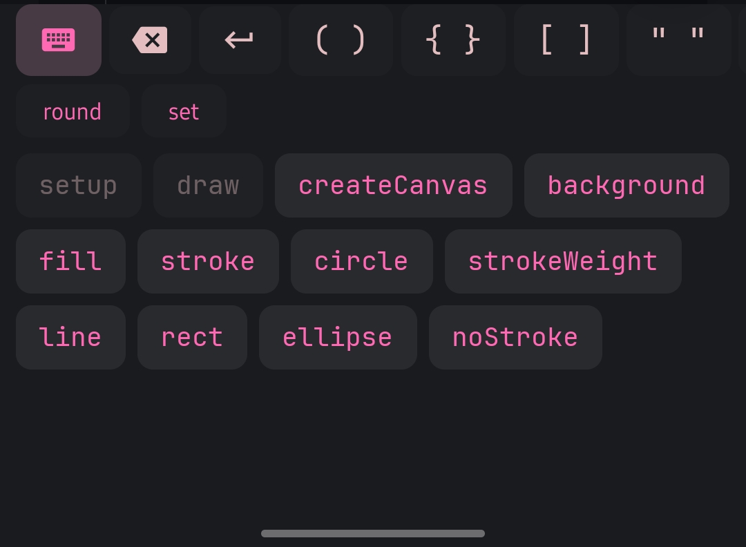
On Android, the system keyboard has some security restrictions that break the user experience of our editing experience in a major way.
There's no way to programmatically show or trigger the system keyboard — the user has to manually tap into the input field to get the focus of the keyboard.
This made toggling from the symbol keyboard to the system keyboard a 2-tap interaction when ideally it should take one click.
Based on the above factors, I found it wiser to just own the full keyboard too so that toggling between the two keyboards would ideally just be swapping data in the same component. Neat and very self contained.
Preview expand toggle
For some exercises, it would be more convenient for the user to preview or interact with their sketch in a larger view. Especially if it involves some form of interactivity. A toggle button next to the output label expands or collapses the sketch preview between its default and a taller view, with a smooth CSS transition.
In-editor settings
Preferences will rarely be uniform across a diverse audience which makes customization more than a "nice to have" feature.
Which makes it important to allow the user to adjust them with as little friction as possible.
In the exercise view, there's a few options that the user may want to customize:
- Font size
- Theme (both editor and UI)
- Word wrapping
- Keyboard height
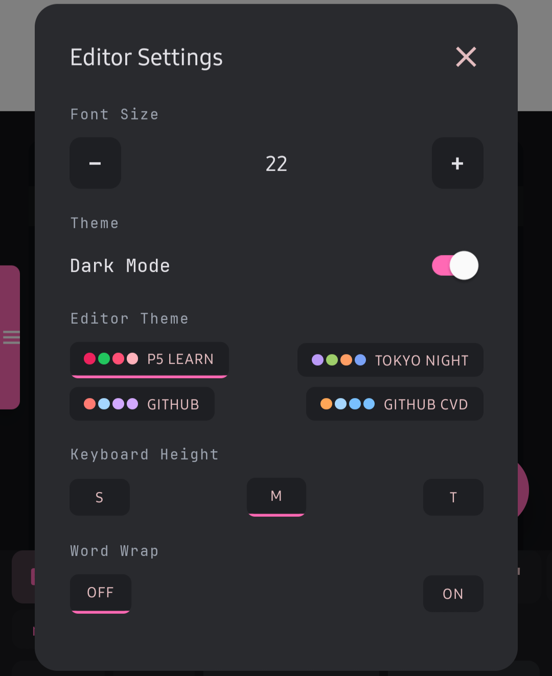
Of course, there may be more options which will be exposed by users as they encounter new frustrations but these felt like the most important ones for now.
Navigation
Did you try bottom navigation?
Side drawers are elegant because they stay out of view during app use. I tried bottom navigation and the experience was awkward because the in-app keyboard would draw over it and conditionally toggling the bottom navigation was not reliable and involved too many code changes to implement.
Breadcrumbs for deep routes
Certain routes in the app tend to get deeply nested and the user needs a way to know where they are.
Breadcrumbs allow this kind of navigation and also serve as a shortcut to jump back to certain routes by tapping on the desired segment.
In the app, these are currently used in the /learn and /ref routes.
Source format and solution validation
Two problems that have taken many experimentations to get to a maintainable and less brittle approach are:
- The source format of our exercises (i.e. the file format of the exercises)
- Solution validation for the user's input (i.e. how we verify that the solution from the user matches the criteria we have in place)
What makes a solution correct?
When the user submits their code, how do we determine if the solution is correct? The most naive approach (and most brittle) would be string comparison, and that's not practical for a lot of reasons.
Another approach would involve pixel matching — rendering the canvas (without drawing to the screen if necessary) and reading the pixel data at certain coordinates to see if the values stay within tolerance ranges. This is not a total solution of course, because some exercises may not render anything visible, so this approach would be useless on its own.
What I needed was a hybrid approach where different rules exist and each exercise specifies the one(s) it is using. For example, an exercise might check that the user called a specific function with the right number of arguments, then also verify the canvas output with a pixel match:
yaml
Non-pixel rules (like functionCall, functionExists, and canvasSize) run synchronously against the source code using regex. Pixel rules only run after the code-based rules pass, once the sketch has rendered.
Source file format
I wasn't too keen to write the exercise material as TypeScript files by hand because it felt overkill.
Perhaps markdown would do a better job?
That's what I initially thought because it has the advantage of being easy to learn and very human readable too. But I couldn't do anything complex with the source file without going all in with regular expressions and doing clever parsing of strings between special comments. Too complicated to reason about in the long run.
Yet another markup language
The answer was YAML. It has the benefit of having a human readable format and is also powerful enough to define data and its associated behaviour, for example the validators associated with an exercise's tasks.
It also meant that I didn't need to manually create newline characters or some other clever character escaping (encoding). Here's what a minimal exercise looks like:
yaml
The YAML files are transpiled to TypeScript modules at build time, so the app loads them as plain imports at runtime without any YAML parsing on the device.
Wrapping it up
There's obviously more improvements to be made to improve accessibility and ensure that the app embraces the user by giving them the perfect environment to learn at ease, with customization a few clicks away. The content is only as good as its presentation more often (the "Don't judge a book by its cover" phrase won't cut it)